Build a Custom Frontend for Voxit
1. Introduction
The Voxit Web Components provide building blocks that facilitate the creation of custom frontends for Voxit.
 This tutorial demonstrates how to create a basic frontend from scratch in multiple steps using these web components.
The resulting frontend supports authentication and displays the conversation title and topic, allows participants to vote on statements and to submit their own statements.
However, it is not a finished product, but rather intended as a starting point for development.
If a ready-to-use frontend is required, the Voxit Reference Frontend can be quickly set up and customized to a certain extent.
This tutorial demonstrates how to create a basic frontend from scratch in multiple steps using these web components.
The resulting frontend supports authentication and displays the conversation title and topic, allows participants to vote on statements and to submit their own statements.
However, it is not a finished product, but rather intended as a starting point for development.
If a ready-to-use frontend is required, the Voxit Reference Frontend can be quickly set up and customized to a certain extent.
The provided example code consists of plain JavaScript and HTML, with minimal styling via CSS. However, the Voxit Web Components can be integrated with any framework that supports web components, such as React, Vue, or Svelte (see https://custom-elements-everywhere.com/ for a more comprehensive list of supported frameworks).
The Voxit Web Components are available on npm (@voxit/voxit-web-components), the project is hosted on GitLab, and reference documentation is available on the Voxit technical documentation website. The JavaScript library providing the web components depends only on the Voxit Web Client library, which offers a low-level abstraction over the Voxit API Server HTTP API. Neither library requires a build step, that is the source files can be imported directly as JavaScript modules without the need for a build system or bundler.
The main—and only mandatory—element (i.e., the <voxit-conversation> element, which represents a conversation) provides behavior such as retrieving conversation data, handling updates and state changes, and handling user interactions like voting and statement submission.
All other optional helper elements, which display conversation data or handle user interactions, can be styled freely.
It is also possible to reimplement their functionality using any compatible JavaScript framework.
2. Setting Up a Development Environment
The Voxit project provides a development environment based on Docker Compose, which can be used for developing and testing custom frontends.
To use it, ensure that you have Git, Docker Compose, and npm installed.
Then clone the voxit-docker repository, including its Git submodules:
git clone --recurse-submodules https://gitlab.com/voxit/voxit-docker.git
Copy the provided dev.env file to .env so that it is read by Docker Compose:
cd voxit-docker && cp dev.env .env
Edit the .env file and set VOXIT_API_SERVER_AUTHENTICATION_DISABLED to true in order to temporarily disable authentication.
Next, start the development environment using Docker Compose in watch mode. This ensures that changes to files on the host are synchronized with the corresponding files inside the containers, enabling near-instantaneous testing of modifications:
docker compose -f docker-compose.yaml -f docker-compose.dev.yaml up --watch
If you encounter any issues or want to customize the development environment, refer to the Voxit Docker documentation.
The voxit-docker project contains an empty directory ./static, the contents of which are served within the Docker network at https://www.voxit.internal/static/.
This location can be customized using the VOXIT_FRONTEND_STATIC_DIR environment variable, if necessary.
In preparation for testing the fontend, a test conversation must be created in Polis, refer to the voxit-docker documentation for instructions on how to configure your browser and access the Polis instance.
3. Embedding a Conversation
For this tutorial, npm will be used to install the Voxit Web Component and Web Client JavaScript libraries, and esbuild will be used to bundle all JavaScript code.
Note that it is also possible to integrate or vendor the libraries through other means.
The source files of both voxit-web-components and voxit-web-client can be directly imported by a browser without the need for a bundler or build system.
Switch to the ./static directory and create the following files:
<!doctype html>
<html lang="en">
<head>
<meta charset="UTF-8">
<meta name="viewport" content="width=device-width, initial-scale=1.0">
<title>Voxit Frontend Tutorial</title>
<script type="module" src="bundle.js"></script>
<script type="module">
const conversation = document.querySelector("#conversation");
conversation.addEventListener("voxitstatechange", event => {
    switch (event.state) {
    case "error":
        // a fatal error has occurred
        alert(event.target.error);
        break;
    case "loaded":
        // the conversation has been loaded
        break;
    }
});
</script>
<style>
voxit-conversation {
  &::before {
    display: block;
  }

  /* the conversation is loading */
  &:state(loading)::before {
    content: "Loading…";
  }

  /* the conversation has been loaded */
  &:state(loaded)::before {
    color: green;
    content: "Live";
  }

  /* the conversation is inactive */
  &:state(inactive)::before {
    color: initial;
    content: "Inactive";
  }

  /* a fatal error has occurred */
  &:state(error)::before {
    color: red;
    content: "Error";
  }
}
</style>
</head>
<body>
<article>
<voxit-conversation base="https://voxit-api.voxit.internal/" conversation-id="xxxxxxxxxx" id="conversation">
<h1><voxit-topic></voxit-topic></h1>
<p><voxit-description></voxit-description></h1>
</voxit-conversation>
</article>
</body>
</html>
{
  "scripts": {
    "build": "esbuild index.js --bundle --outfile=bundle.js"
  },
  "dependencies": {
    "@voxit/voxit-web-components": "^0.1.1"
  },
  "devDependencies": {
    "esbuild": "0.28.0"
  }
}
import "@voxit/voxit-web-components";
Install the dependencies by running:
npm install
Open the file index.html, locate the <voxit-conversation> element, and set the conversation-id attribute to the conversation ID of the example conversation you created in Polis.
Bundle the JavaScript dependencies by running:
npm run build
If you open https://www.voxit.internal/static/ in the development environment, you should see a page displaying the topic and description of the example conversation you created.
All interactions with the Voxit HTTP API are handled by the <voxit-conversation> element, its base attribute specifies the URL of the Voxit API server, and the conversation-id refers to a specific conversation.
Both attributes must be set to valid values when the element is added to a document, changing or removing them afterward has no effect.
The element initially attempts to retrieve conversation data and, if successful, regularly polls an active conversation for new statements, updates to conversation result data needed for visualizations, and state changes.
The <voxit-conversation> element communicates with child elements via events, i.e. it emits events in response to state changes, data updates (such as new comments or changed results), or to notify about the results of asynchronous operations such as submitting votes or statements.
The included helper elements, such as <voxit-topic> and <voxit-description>, make use of this and update their contents automatically once the conversation data has been loaded.
The voxitstatechange event can be used to handle state changes, in particular to take action when a conversation has been loaded or if an error has occurred:
const conversation = document.querySelector("#conversation");
conversation.addEventListener("voxitstatechange", event => {
    switch (event.state) {
    case "error":
        // a fatal error has occurred
        alert(event.target.error);
        break;
    case "loaded":
        // the conversation has been loaded
        break;
    }
});
State changes of a conversation are also propagated through custom states of the <voxit-conversation> element, which can be used to style its contents accordingly:
voxit-conversation {
  &::before {
    display: block;
  }

  /* the conversation is loading */
  &:state(loading)::before {
    content: "Loading…";
  }

  /* the conversation has been loaded */
  &:state(loaded)::before {
    color: green;
    content: "Live";
  }

  /* the conversation is inactive */
  &:state(inactive)::before {
    color: initial;
    content: "Inactive";
  }

  /* a fatal error has occurred */
  &:state(error)::before {
    color: red;
    content: "Error";
  }
}
If new statements are added or results change, voxitstatechange and voxitresultschange events are emitted, respectively.
If a conversation becomes inactive, polling for changes stops and a voxitconversationchange event is emitted.
Any included interactive helper elements, such as the <voxit-vote-button> element, will be disabled automatically.
4. Voting
<!doctype html>
<html lang="en">
<head>
<meta charset="UTF-8">
<meta name="viewport" content="width=device-width, initial-scale=1.0">
<title>Voxit Frontend Tutorial</title>
<script type="module" src="bundle.js"></script>
<script type="module">
const conversation = document.querySelector("#conversation");
conversation.addEventListener("voxitstatechange", event => {
    switch (event.state) {
    case "error":
        // a fatal error has occurred
        alert(event.target.error);
        break;
    case "loaded":
        // the conversation has been loaded
        break;
    }
});

conversation.addEventListener("voxitvotesubmiterror", event => {
    alert(event.error);
});
</script>
<style>
voxit-conversation {
  &::before {
    display: block;
  }

  /* the conversation is loading */
  &:state(loading)::before {
    content: "Loading…";
  }

  /* the conversation has been loaded */
  &:state(loaded)::before {
    color: green;
    content: "Live";
  }

  /* the conversation is inactive */
  &:state(inactive)::before {
    color: initial;
    content: "Inactive";
  }

  /* a fatal error has occurred */
  &:state(error)::before {
    color: red;
    content: "Error";
  }
}
</style>
</head>
<body>
<article>
<voxit-conversation base="https://voxit-api.voxit.internal/" conversation-id="xxxxxxxxxx" id="conversation">
<h1><voxit-topic></voxit-topic></h1>
<p><voxit-description></voxit-description></h1>
<blockquote><voxit-statement>There are no more statements.</voxit-statement></blockquote>
<div>
<voxit-vote-button type="agree">Agree</voxit-vote-button>
<voxit-vote-button type="neutral">Skip</voxit-vote-button>
<voxit-vote-button type="disagree">Disagree</voxit-vote-button>
</div>
</voxit-conversation>
</article>
</body>
</html>
Voting for statements is a central part of a Voxit frontend, and the Voxit Web Components provide helper elements both for displaying statements and for submitting votes.
Statements are usually presented to participants one after another in a specific order for voting. Meta-statements, if any, are shown first, followed by seed statements, and then user-submitted statements, which are presented in a random order.
The <voxit-conversation> element keeps track of the current statement, and the <voxit-statement> element is updated automatically to display it.
The custom state is-meta of the <voxit-statement> element indicates whether the displayed statement is a meta statement.
When a participant submits a vote, the current statement is replaced with the next statement in the aforementioned order.
If there are no more statements left, the element content is displayed until new statements arrive.
<blockquote><voxit-statement>There are no more statements.</voxit-statement></blockquote>
The <voxit-vote-button> element can be used to submit a vote for the current statement and its type attribute determines the submitted value (agree/neutral/disagree).
Alternatively, a child element of <voxit-conversation> can submit a voxitvotesubmit event to vote for any statement, which does not necessarily have to be the current one.
<div>
<voxit-vote-button type="agree">Agree</voxit-vote-button>
<voxit-vote-button type="neutral">Skip</voxit-vote-button>
<voxit-vote-button type="disagree">Disagree</voxit-vote-button>
</div>
The result of a vote submission can be handled by listening for voxitvotesubmitsuccess and voxitvotesubmiterror events.
conversation.addEventListener("voxitvotesubmiterror", event => {
    alert(event.error);
});
If there are no more statements left, the <voxit-vote-button> elements will remain disabled until new statements arrive.
5. Statement Submission
<!doctype html>
<html lang="en">
<head>
<meta charset="UTF-8">
<meta name="viewport" content="width=device-width, initial-scale=1.0">
<title>Voxit Frontend Tutorial</title>
<script type="module" src="bundle.js"></script>
<script type="module">
const conversation = document.querySelector("#conversation");
conversation.addEventListener("voxitstatechange", event => {
    switch (event.state) {
    case "error":
        // a fatal error has occurred
        alert(event.target.error);
        break;
    case "loaded":
        // the conversation has been loaded
        break;
    }
});

conversation.addEventListener("voxitvotesubmiterror", event => {
    alert(event.error);
});

conversation.addEventListener("voxitstatementsubmiterror", event => {
    alert(event.error);
});
</script>
<style>
voxit-conversation {
  &::before {
    display: block;
  }

  /* the conversation is loading */
  &:state(loading)::before {
    content: "Loading…";
  }

  /* the conversation has been loaded */
  &:state(loaded)::before {
    color: green;
    content: "Live";
  }

  /* the conversation is inactive */
  &:state(inactive)::before {
    color: initial;
    content: "Inactive";
  }

  /* a fatal error has occurred */
  &:state(error)::before {
    color: red;
    content: "Error";
  }
}

textarea {
  display: block;
}
</style>
</head>
<body>
<article>
<voxit-conversation base="https://voxit-api.voxit.internal/" conversation-id="xxxxxxxxxx" id="conversation">
<h1><voxit-topic></voxit-topic></h1>
<p><voxit-description></voxit-description></h1>
<blockquote><voxit-statement>There are no more statements.</voxit-statement></blockquote>
<div>
<voxit-vote-button type="agree">Agree</voxit-vote-button>
<voxit-vote-button type="neutral">Skip</voxit-vote-button>
<voxit-vote-button type="disagree">Disagree</voxit-vote-button>
</div>
<label for="statement">Statement:</label>
<textarea id="statement" name="statement" placeholder="Your own statement" rows="3" maxlength="140"></textarea>
<voxit-submit-button submitfor="statement">Submit</voxit-submit-button>
</voxit-conversation>
</article>
</body>
</html>
Participants can submit statements using the <voxit-submit-button> element in connection with an associated text input element.
The required submitfor attribute must reference the ID of either an <input> or <textarea> element which contains the statement to be submitted.
Alternatively, a child element of <voxit-conversation> can emit a voxitstatementsubmit event to submit a statement.
The API supports statements up to 1000 characters in length, although input elements are usually restricted to a shorter maximum length.
<label for="statement">Statement:</label>
<textarea id="statement" name="statement" placeholder="Your own statement" rows="3" maxlength="140"></textarea>
<voxit-submit-button submitfor="statement">Submit</voxit-submit-button>
The result of a statement submission can be handled by listening for the voxitstatementsubmitsuccess and voxitstatementsubmiterror events.
conversation.addEventListener("voxitstatementsubmiterror", event => {
    alert(event.error);
});
Statement submission can be disabled for a conversation and in that case, the <voxit-submit-button> element will be in a disabled state.
The client.statementsAllowed property of the <voxit-conversation> element indicates whether statement submission is currently allowed.
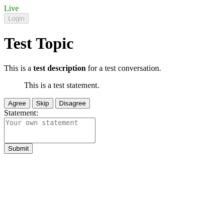
6. Handling Authentication
<!doctype html>
<html lang="en">
<head>
<meta charset="UTF-8">
<meta name="viewport" content="width=device-width, initial-scale=1.0">
<title>Voxit Frontend Tutorial</title>
<script type="module" src="bundle.js"></script>
<script type="module">
const conversation = document.querySelector("#conversation");
conversation.addEventListener("voxitstatechange", event => {
    switch (event.state) {
    case "error":
        // a fatal error has occurred
        alert(event.target.error);
        break;
    case "loaded":
        // the conversation has been loaded
        break;
    }
});

conversation.addEventListener("voxitvotesubmiterror", event => {
    alert(event.error);
});

conversation.addEventListener("voxitstatementsubmiterror", event => {
    alert(event.error);
});

conversation.addEventListener("voxitauthenticationerror", event => {
    alert(event.error);
});
</script>
<style>
voxit-conversation {
  &::before {
    display: block;
  }

  /* the conversation is loading */
  &:state(loading)::before {
    content: "Loading…";
  }

  /* the conversation has been loaded */
  &:state(loaded)::before {
    color: green;
    content: "Live";
  }

  /* the conversation is inactive */
  &:state(inactive)::before {
    color: initial;
    content: "Inactive";
  }

  /* authentication is required */
  &:state(unauthenticated)::before {
    color: red;
    content: "Authentication is required"
  }

  /* a fatal error has occurred */
  &:state(error)::before {
    color: red;
    content: "Error";
  }
}

textarea {
  display: block;
}
</style>
</head>
<body>
<article>
<voxit-conversation base="https://voxit-api.voxit.internal/" conversation-id="xxxxxxxxxx" id="conversation">
<voxit-login-button>Login</voxit-login-button>
<h1><voxit-topic></voxit-topic></h1>
<p><voxit-description></voxit-description></h1>
<blockquote><voxit-statement>There are no more statements.</voxit-statement></blockquote>
<div>
<voxit-vote-button type="agree">Agree</voxit-vote-button>
<voxit-vote-button type="neutral">Skip</voxit-vote-button>
<voxit-vote-button type="disagree">Disagree</voxit-vote-button>
</div>
<label for="statement">Statement:</label>
<textarea id="statement" name="statement" placeholder="Your own statement" rows="3" maxlength="140"></textarea>
<voxit-submit-button submitfor="statement">Submit</voxit-submit-button>
</voxit-conversation>
</article>
</body>
</html>
Before adding support for authentication, the development environment must be reconfigured.
Edit the .env file and set VOXIT_API_SERVER_AUTHENTICATION_DISABLED to false to enable authentication.
Then restart the containers:
docker compose -f docker-compose.yaml -f docker-compose.dev.yaml up --watch
The <voxit-conversation> element emits a voxitauthenticationchange event each time the authentication state changes, e.g., when a conversation has been loaded or when the session has expired.
The unauthenticated state is also propagated as a custom state of the <voxit-conversation> element and can be used to indicate that authentication is required:
  /* authentication is required */
  &:state(unauthenticated)::before {
    color: red;
    content: "Authentication is required"
  }
The <voxit-login-button> element can be used to initiate authentication via OpenID Connect.
When activated, a popup redirecting the user to the configured authentication provider will be opened.
If authentication is disabled or during the authentication process, the element will be in disabled state.
Alternatively, a child element of <voxit-conversation> can emit a voxitauthenticate event to start the authentication process.
<voxit-login-button>Login</voxit-login-button>
The result of the authentication process can be handled by listening for voxitauthenticationsuccess and voxitauthenticationerror events.
conversation.addEventListener("voxitauthenticationerror", event => {
    alert(event.error);
});
7. Conclusion
This tutorial has demonstrated how to build a basic frontend for a Voxit conversation using the Voxit Web Components which implements voting, statement submission and authentication.
It lacks result visualization (see voxitresultschange) and support for subscribing to email notification (see the <voxit-notifications-checkbox> element.
The Voxit Web Components offer a high degree of flexibility, optional helper elements may be reimplemented by communicating with the <voxit-conversation> element via events.
Furthermore, the ConversationClient object which is made available through the VoxitConversationElement.client property provides full access to all conversation data.
While the tutorial embeds a specific conversation it is possible to dynamically create a <voxit-conversation> element with a conversation-id attribute based on user input.
See the Voxit Reference Frontend or the Voxit ParticipationUI Frontend for examples of this and other features of a complete frontend.